Changes Are Coming!
I’m currently in the process of redesigning this blog and changing the name!!!
I Do Windows will become The Fashion Teacher. This will allow me to combine my fashion classes into one cohesive website, instead of directing the styling students to the visual merchandising blog. It was always confusing for them!
Once it’s up you can still click on here for a while, but it will redirect you to the new site under its own domain name – The Fashion Teacher.com – I’m excited because I’ve been wanting to do this for a long time now, but time is my issue (I don’t have enough of it)! I finally found a web company that is friendly and easy to work with, to help manage it for me.
I’m also excited for some new ideas I have for the site. I want to continue to post instructional articles, but also showcase more work from students, and other readers.
If there is anything you would like to see on the site let me know. I would love to hear your suggestions and feedback.
Thanks for reading!
Ebay’s “Shoppable Windows”

If you are in the New York City area on June 8th thru July 7th, then go by one of these four locations to view Ebay’s interactive windows:
- 175 Orchard Street
- 154 Spring Street
- 7 w. 18th Street
- 30 Gansevoort Street
Ebay will be covering up empty storefront windows with “shoppable windows”. The interactive windows will allow shoppers to purchase items from Kate Spade’s Saturday collection. You will order the items on the big screen and have them delivered to you within the hour. The customer pays the delivery person with a Pay-pal credit card reader.
This is one way to connect your brick and mortar store with the digital world! I’ve always told students that you should treat your windows as another sales tools. Ebay now proves it!
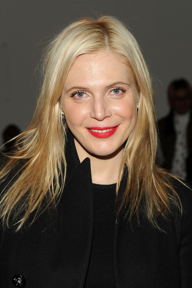
[FASH 54A] RIP Annabel Tollman
It is so sad when someone so young dies suddenly. The Cut is reporting that stylist Annabel Tollman died suddenly in her sleep from a blood clot. She was only 36 years old. She was a stylist to America Ferrera, Shakira, the Olsen twins, and Scarlett Johansson, just to name a few.
She earned a fashion journalism degree from Central St. Martins in London, and was in process of developing a reality show for Bravo at the time of her death. I’m sure her show would have been more realistic than the current shows on Bravo featuring stylists.
My prayers go out to her family.
(image)
[FASH 49] More photos of student’s displays
Here are the rest of the photos from various weeks throughout the semester of the visual merchandising class:

Wedding theme: This display from Group 2 was too pretty for words! All of the flowers were hand-made!

Sports theme: Group 1 did a fantastic job with their Men’s Health display considering the bad shape of the shelf unit. They literally transformed it! The stack of chairs on the side are helping to hold it up (lol)!

Fashion Designer theme: This Tory Burch display is another example of how a few dollars and a lot of man hours can go a long way. The fabulous floral logo was all done by hand! – Group 4

Fashion Designer theme: Here’s a table display in progress from Group 1. That bust form is amazing, it is almost an exact replica of what The Blonds created for their runway show!

Green/Eco-friendly theme: Here’s a completed cube presentation from Group 5. I love that they chose to provide signage above the display and not just on the table. It frames the presentation and makes it complete. I could see this in a LUSH store for sure!

“Pick a City” theme: This was such a fun display from Group 4! Pick a city meant the teams could choose any city they wanted to build a display around.

Music theme: Group 1 had the challenge this week of working on the beaten up shelving unit, but the way they transformed it, you can hardly tell! This was a delicious display ,and notice the under-cabinet lighting they provided. A very important and good detail!

Green/Eco-friendly theme: This was the best window display this semester. Group 2 reused a few flowers from their wall display.


Music theme: This Coachella display was perfect, from the lights they included around the ferris wheel backdrop, to the floral headband – Group 2 – I loved it!!!

Fashion Designer theme: Here’s another window that impressed. Group 6, which were on a British kick for the class :), chose famed milliner Philip Treacy as their designer to highlight. Each student hand-made a hat to display in their overall design. The big flower arrangement you see is a hat as well!
There were so many other projects that were good, but these are a few that really stood out to me. They all learned that display work:
- Is not easy!!!
- Requires everyone’s assistance the day of installation
- You eventually have to settle on an idea and get to work
- You need to be organized and allow time ahead of the due date to purchase materials/supplies
- Paint needs time to dry – or else you get it everywhere!
- Conditions are not always ideal, but you gotta deal with it and move ahead
- Sometimes you gotta improvise
- No one sees your mistakes unless you point them out
- COMMUNICATE, COMMUNICATE, COMMUNICATE with your team!
Like I said before it was a great semester and I am so proud of the work my students have produced, you guys ROCK!
FASH 54A I haven’t forgotten about you guys. I will be posting your fashion editorials and advertisements soon. It’s just A LOT of photos and model release forms to sort through. But in the meantime I will post the photos from your very first project, where you had to “re-style” yourself in whatever outfit you choose to wear to class that day – remember that? I know some of you are cringing right now (lol)! I promised you they wouldn’t be seen by anyone else but me, but some of you did fabulous work that should be seen!
[FASH 49] – Final Group Projects
Each week students were tasked with designing and installing displays according to a theme I provided. This semester’s class was larger than usual. I had 52 students!! Many hands do make for lighter work, but it can also get really crowded in our small classroom with everyone working on either a:
- Window display
- Cubes (had to present twice)
- Table display
- Wall display
- Shelving display
Here are a few pictures from some their work:

This is actually a display from Group 6. It was the first week group projects launched. The theme for this week was POP CULTURE. I thought it was so clever that they used three very distinct time periods that Britain is known for – the Mod 60s, the Punk era, the Royals, which is reflected in the decoupage of their hand-made blocks inside the cubes.


The above display is from Group 2. Their cube display for POP CULTURE week was inspired by the artist Yayoi Kusama as you can see in the book cover of Alice’s Adventures in Wonderland.

Up above, Group 4 also looked to Great Britain for inspiration in the iconic image of the Beatles crossing the street. They actually continued the street on the table! Nicely done!


Group 1 looked to the current fashion trend of studs as their POP CULTURE inspiration! I loved everything about this display, it’s nicely balanced, clean, and they cross-merchandised.

Considering all the displays shown above was everyone’s first time at doing this type of work, I must say I was impressed! Students are required to provided all materials and merchandise themselves, they get no outside help, besides each other! Is it tough to work this way? YES, but in the world of display one of the first things you must learn and really need to be is RESOURCEFUL.
Throughout the weeks I saw many groups recycling materials and props into other displays – without me having to tell them, they automatically realized that is basically what display is all about! Stores don’t have unlimited budgets to spend on one-off props, so how do you take what’s used and make it look new again. If you can do that you will have a long and prosperous career as a display artist!
In my next post I will show more photos of student group projects from the other themes of:
- Holiday/Wedding
- Sports/Music
- Fashion Designer
- “pick a City”
- Green (eco-friendly)
FASH 49/FASH 54A – We made it to the end!
Hello Everyone,
Well the semester is over and what a semester it has been! A big thanks to both my fashion classes (Visual Merchandising – FASH 49 and Fashion Styling – FASH 54A) for sticking by me this semester; for those who do not know, I became extremely ill for almost most of February, and I’ve been playing catch up ever since then. I had to cancel classes, or call in a substitute, and even teach while sick, but you stayed with me and didn’t drop my classes, THANK YOU!
Final grades are already posted and as always please contact me at school if you have any questions or concerns regarding the grade you earned. I think most of you will be happy with your grades as the talent was exceptional! My next post will be showing some of the work from both classes.
I wish you all a wonderful summer break! I will be teaching summer school in the construction program. I’m sadden by the fact that some of you will no longer be by students, as there are no more classes I teach for you to take. Please keep in touch and let me know what you are up to, and “friend”me on Facebook if you like. I use Facebook predominately for work and school and I am connected with many of my past students.
See you in the fall!

Window Dresser v. Fashion Stylist
Lately students have been asking which of my two classes should they take? They can’t decide if they should focus on visuals or styling? I scratch my head with a bemused look and say why not do both!?!
Some give me an incredulous look and say, “really?” I reply, “think about it, what’s the difference, between the two jobs?”
A visual person is a stylist ,and stylists do visuals. I guess most people never really thought about it, but it’s true. It’s how I can teach both subjects – the skill set is interchangeable. If you can dress a mannequin, you can dress a model. If you can prop a window, you can prop a set. Both employ the principles of design, take loads of creativity, and are hard work. Sure there are some differences to working in a store, as opposed to a photo shoot, but we are all cut from the same cloth.
I’ve had a few arguments with myself trying to decide which is harder, visuals or styling? Sometimes visuals win the argument, and sometimes styling. When doing a store, it’s very physically demanding, but there’s fewer people I have to deal with, as I change out mannequins, set-up interior displays, or do floor sets. I oftentimes, just follow my store directives and do my thing! When styling there’s a lot of people on set, but the atmosphere is very fun, jobs are almost always catered, it’s not too physically demanding (unless you are a prop stylist, and working with big items), and you get to play with clothes all day.
Which is more fun? Only you can answer that. I don’t really like styling as much as I like building and making things, so visuals win out for me every time! Yet visuals can get boring if you work for a chain retailer, because you don’t get to be as creative as the old days. Now you just follow a store directive and almost everything is sent to you to assemble and install. Freelance projects is when you get to use your own ideas.
Styling still requires your creative skills, as the client is looking to you to bring their idea to life – so this can be really fun!
You will find that lots of visual folk, freelance as stylists, or are repped by an agent for styling work, and some stylists also do the occasional window. You should too!

Is this a display of bracelets in a jewelry case at a store, or was this image ripped from a magazine?

Is this a makeup display in a cube at a store ,or was this image ripped from a magazine?
For both images above does it matter? They could have easily been created by either a visual display person or a fashion stylist!
(images via Pinterest)
FASH 49: Store Design
Last week in class the lecture was on Store Design, and why it’s so important to a store’s brand identity or the image they wish to project. I know the lecture took the whole three-hour class time, and I hope I didn’t bore too many of you, but once you see a store design done really well, then you understand it’s importance.
Such as this picture. When I saw this, I immediately thought, “Now that makes a statement!”

These individual shadow boxes would be fun to dress!
(image via pinterest)
FASH 54A: Re-style Yourself
Today I will be in introducing your first class project called “The clothes off your back”. Whatever you wear to class today will be photographed and documented. Your assignment is to re-style these clothes into two different looks.
You will pair up in teams (2 or 3 people, no more than this).
You can ONLY use the clothes you are wearing today. You are allowed to switch out the accessories or change items of clothing with your partner, but you can not change the tops or bottoms of the outfit you are wearing TODAY! Last semester I warned the class when this assignment was approaching, so most people “dressed up” for that day of class. This time I’m springing it on you!
Have fun with this first styling project, and don’t play it safe. A hand-out is given in class outlining all the details of the project and the due date. Here are some good and some great pictures of last year’s students:
These two ladies did a good job!


This is one of my favorites. Nancy did a great job and really thought outside the box!


The point of this exercise is to:
- get you comfortable working with clothing, especially for my students who are new to fashion.
- get you use to styling others, which is why you work with a partner, as s stylist you will be styling other folk, not yourself.
- get you to start thinking of tops and bottoms in a non traditional way. I love how Nancy took her coat and wrapped it as a skirt in the second photo, and used her sweater as “pants” in the first photo!
- Most importantly have fun with this exercise!
See you in class!
How to tie a bow tie
Now that the holidays are upon us, everyone is getting dressed up in their finest to attend a slew of festivities, for men that usually means donning a tie of some sort. Here’s the best tutorial I’ve found that gives a clear lesson on how to tie a bow tie.
We ladies may not wear a bow tie as often as men (I have been known, but it’s good to know in case you ever need to tie one on a model, mannequin, or bust-form.


leave a comment